Magazine
September 4, 2024
Type Anatomy
Typography is the art of arranging and designing text in a legible, clear, visually appealing way. Let’s go over the anatomy of typography and words we use to describe it.
The Type Terminology
A graphic designer needs to understand the anatomy of letterforms to appreciate and recognize the differences between typefaces. Typefaces are made up of different components such as ascender, aperture, bowl and counter. Type designers use these components to create typefaces that appear legible and have an overall appealing appearance.
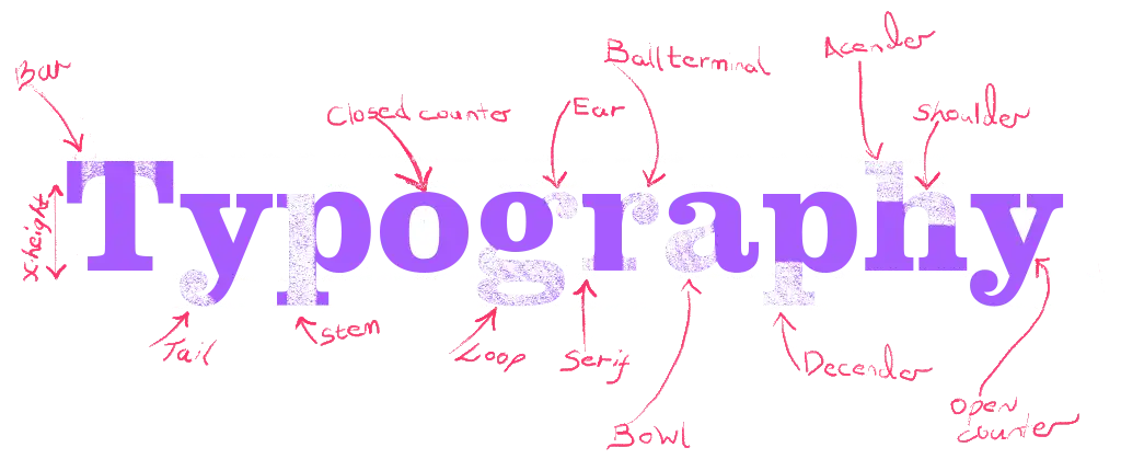
A typeface consists of various parts, aperture, ascender, baseline, cap height, descender and x-height.
Every typeface has a unique appearance and specific characteristics that set it apart from others. The choice of typography is crucial in creating the right message for your users. The words themselves are important, but the font style and layout also play a vital role in conveying the message effectively onscreen.
Having a good understanding of the different typefaces and their features is essential in making informed decisions. This knowledge will help you make better choices when selecting and applying any typeface, ultimately leading to more visually appealing and meaningful content.
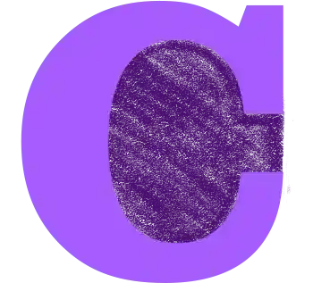
Aperture
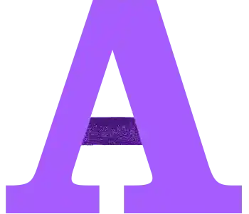
The partially enclosed space of a letterform, such as the opening of the letter C or the gap between the two stems of the letter A.
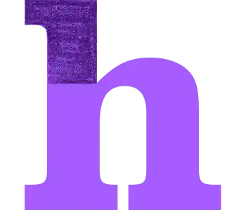
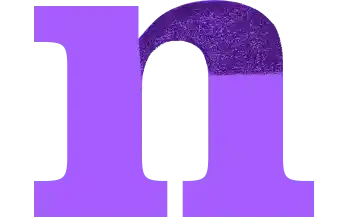
Ascender
An upward vertical stroke that extends beyond the x-height, which is the height of the lowercase letter x. For example, the letters b, d, f, h, k, and l have ascenders.

Loop
The enclosed or partially enclosed downward extension on lowercase letters such as 'g' and 'y', distinct from the bowl or main circular part.

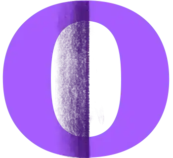
Bowl
The generally round or elliptical forms which are the basic body shape of letters, such as the letter O or the letter P.
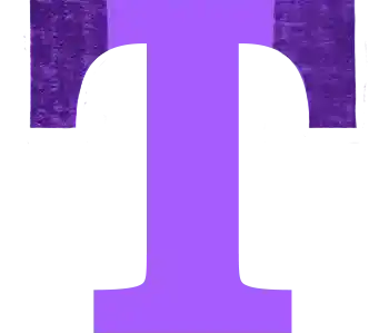
Overhang
An overhang on elements of letters f, F, T, or V extending slightly beyond the main stroke's width, improving letter spacing and visual harmony in typography.
Crossbar
The horizontal stroke in letters, such as the middle bar of the letter E or the top bar of the letter T.
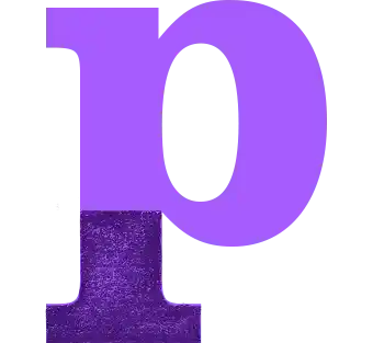
Descender
The horizontal stroke in letters, such as the middle bar of the letter E or the top bar of the letter T.

Stroke
The diagonal stroke that connects the two verticals in the letter 'N', defining its structure and distinguishing its form.

Leg
A leg is the downward stroke on letters such as 'K' or 'R' that extends at an angle from the main body.
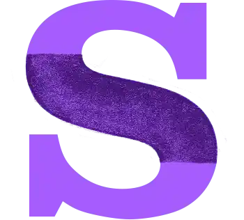
Spine
The main curved stroke of a lowercase or capital S.
Shoulder
A curved stroke originating from a stem, such as the top part of the letter R or the bottom part of the letter N.
Bracket
A bracket is a curved or angled connection between the stem and serif of a letter, smoothing the transition and adding stylistic nuance to the typeface's appearance.
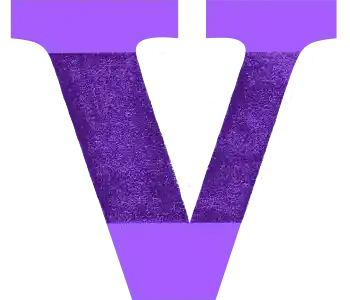
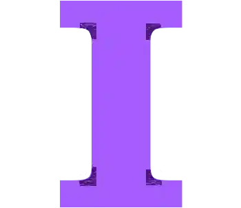
Stem
A main stroke that is more or less straight, not part of a bowl, such as the vertical bar of the letter I or the diagonal bar of the letter V.
Stress (or Axis)
A stress or axis is the orientation of thin and thick strokes in letters, indicating the direction of contrast, which can be vertical, horizontal, or diagonal.
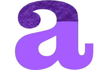
Double-Story
A double-story refers to a letterform that has two distinct parts or stories, such as the 'a' and 'g', contrasting with single-story versions of these letters.
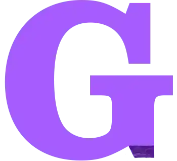
Beard
The beard of a 'G' refers to the small, projecting horizontal stroke or spur at the bottom right of the letter.

Chin
The chin, jaw, or hook on a 'G' refers to the distinctive, projecting part at the bottom or the interior curve.
 04 Sep 24
Type Anatomy
Typography is the art of arranging and designing text in a legible, clear, visually appealing way. Let’s go over the anatomy of typography and… 14 Jan 24
The Fear of Art
Lorem ipsum dolor sit amet, consectetur adipiscing elit, sed do eiusmod tempor incididunt ut labore et dolore magna aliqua. Ut enim ad minim veniam,… 14 Jan 24
Design Systems
Lorem ipsum dolor sit amet, consectetur adipiscing elit, sed do eiusmod tempor incididunt ut labore et dolore magna aliqua. Ut enim ad minim veniam,… 04 Jan 24
Atomic Design
Designing for multiple device sizes and platforms without a design system can lead to challenges that compromise consistency and efficiency.… 04 Jan 24
Typographic Scales
In the intricate world of web development, where every detail counts, typography scales emerge as the unsung heroes of design efficiency and user experience.…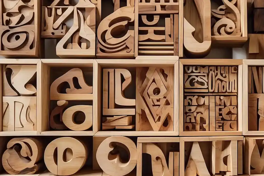 04 Jan 24
Classifying Typefaces
Typography is a crucial element of design, playing a significant role in how we perceive and interact with visual content. Understanding the various classifications… 14 Dec 23
FOCUS
Lorem ipsum dolor sit amet, consectetur adipiscing elit, sed do eiusmod tempor incididunt ut labore et dolore magna aliqua. Ut enim ad minim veniam,…