Magazine
January 4, 2024
Classifying Typefaces
Typography is a crucial element of design, playing a significant role in how we perceive and interact with visual content. Understanding the various classifications of typefaces and their unique characteristics is essential for designers and enthusiasts alike.
A Guide to Typography
In this comprehensive guide, we will explore the history of typography classification, delve into the basic categories of serif, sans-serif, and script typefaces, and examine the various attempts at creating standardized classification systems.
The origins of type classification can be traced back to the early days of printing, when movable type revolutionized the dissemination of information.
History of typography classification
The origins of type classification can be traced back to the early days of printing, when movable type revolutionized the dissemination of information. As printing technology evolved, so did the development of typefaces, with typographers and type foundries playing a pivotal role in shaping the classification landscape. Traditional classification systems, such as Vox-ATypI and British Standards, emerged as a means to categorize and understand the growing variety of typefaces.
Basic Classification of Serif, Sans-Serif, & Script
Typefaces can be broadly categorized into three main groups: serif, sans-serif, and script.Serif typefaces are characterized by the small lines or strokes attached to the ends of characters, known as serifs. These typefaces often evoke a sense of tradition, elegance, and readability, making them suitable for body text and long-form content.
Sans-serif typefaces, on the other hand, lack the decorative serifs and feature clean, simple lines. They are often associated with modernity, minimalism, and clarity, making them popular choices for digital interfaces and headlines.
Script typefaces mimic the fluidity and style of handwriting, ranging from formal calligraphy to casual brush strokes. They are often used for decorative purposes, logos, and invitations, adding a touch of personality and charm to designs.
The Various Attempts at Creating Classification Systems
Over the years, several organizations and institutions have endeavored to create standardized classification systems for typefaces. The British Standards Classification of Typefaces, developed in the 1960s, provided a framework for categorizing typefaces based on their historical and stylistic attributes. The DIN (Deutsches Institut für Normung) classification system, originating in Germany, offered another approach to organizing typefaces.
Type foundries and software companies have also contributed to the classification discourse. Bitstream, Linotype, and Adobe have each developed their own classification systems, aiming to provide a more practical and user-friendly approach to understanding and selecting typefaces.
General Classification Categories & Descriptions
While classification systems may vary, there are several widely accepted categories that help us understand the nuances of typeface design. These include:
Humanist Typefaces
Humanist typefaces are rooted in the calligraphic traditions of the Italian Renaissance, embodying the natural flow and variation of handwritten letters. They often have open apertures, a warm and friendly feel, and moderate stroke contrast, which makes them highly legible in text.
Humanist typefaces like Dante and Gill Sans are known for their organic structure, which echoes the forms created by a broad-nib pen. This category is particularly effective for body text in print and on screens, as it combines readability with a subtle, personable character
Script Typefaces
Script typefaces are designed to emulate the fluidity and expressiveness of handwriting. They can range from elegant, formal styles with precise connections between letters, like those found in wedding invitations, to more casual, free-flowing scripts that add a personal touch to branding and advertising.
Quintessential script typefaces often feature cursive construction with varied stroke weights and may include embellishments that mimic the nuances of penmanship. They are best used for display purposes where a touch of elegance or individuality is desired.
Decorative Typefaces
Decorative typefaces, also known as display or ornamental fonts, are created to grab attention and make a statement. They often mimic the appearance of other writing systems or incorporate thematic elements, such as those found in fonts that resemble ancient scripts or modern graffiti.
These typefaces are characterized by their unique and often elaborate designs, which can include unusual shapes, patterns, or textures. Decorative fonts are typically used for headlines, posters, and any design work where a distinctive visual impact is the goal.
Old Style Typefaces
Old Style typefaces, also known as Garalde, emerged during the Renaissance and are characterized by their moderate contrast in stroke weight, bracketed serifs, and a diagonal stress in the rounded characters.
They convey a classic, scholarly vibe, making them a staple in the publishing industry, especially for setting large bodies of text. Examples of Old Style typefaces include Garamond and Caslon, which are renowned for their elegance and excellent readability in print.
Blackletter Typefaces
Blackletter typefaces, sometimes referred to as Gothic or Old English, are known for their dense, calligraphic appearance with angular strokes and elaborate flourishes. Originating in the Middle Ages, these typefaces were commonly used in early printed books.
Today, Blackletter is often associated with tradition, formality, and period-specific designs. It is used in contexts that call for a dramatic, historical, or classical feel, such as certificates, newspaper mastheads, and certain branding elements
Transitional Typefaces
Transitional typefaces represent the evolution from Old Style to Modern typefaces, featuring greater contrast between thick and thin strokes, vertical stress, and less bracketing on the serifs.
They strike a balance between the traditional warmth of Old Style and the stark geometry of Modern typefaces. Baskerville is a prime example of this category, offering a crisp, clear presence in print, which makes it suitable for both body text and headings in a variety of design applications
Slab Serif Typefaces
Slab Serif typefaces, also known as Egyptian, are characterized by their thick, block-like serifs and minimal contrast in stroke weight. They project a bold, contemporary feel and are often used in advertising, posters, and headlines where a strong statement is required.
Slab Serifs like Rockwell and Clarendon provide a solid, stable look, making them a popular choice for designers looking to combine modern impact with a touch of tradition.
Glyphic Typefaces
Glyphic typefaces draw inspiration from inscriptions and engravings, often featuring flared stroke terminals or triangular serifs that resemble chiseled marks. They exude a sense of formality and durability, reminiscent of classical architecture and sculpture.
Glyphic fonts like Trajan are based on Roman letterforms and are commonly used for logos, movie posters, and book covers where a sense of antiquity and authority is desired. Their distinctive style makes them less suitable for body text but excellent for creating a memorable visual identity
The Future of Typeface Classification
The classification of typefaces is an ever-evolving field, with new technologies and digital design pushing the boundaries of typography.
Digital Typography
The rise of digital typography has introduced new challenges and opportunities for type classification.
User Experience
As user experience becomes increasingly important, the functionality of typefaces takes on greater significance.
New Categories
The potential for new categories and systems to emerge is vast, reflecting the dynamic nature of design.
Conclusion
Understanding the classification of typefaces is crucial for any designer or typographer. It not only aids in the selection of type for specific purposes but also enriches our appreciation for the art of typography.
As we continue to witness the evolution of type, the importance of classification will remain a constant, guiding designers in their quest for the perfect type.
 04 Sep 24
Type Anatomy
Typography is the art of arranging and designing text in a legible, clear, visually appealing way. Let’s go over the anatomy of typography and… 14 Jan 24
The Fear of Art
Lorem ipsum dolor sit amet, consectetur adipiscing elit, sed do eiusmod tempor incididunt ut labore et dolore magna aliqua. Ut enim ad minim veniam,… 14 Jan 24
Design Systems
Lorem ipsum dolor sit amet, consectetur adipiscing elit, sed do eiusmod tempor incididunt ut labore et dolore magna aliqua. Ut enim ad minim veniam,… 04 Jan 24
Atomic Design
Designing for multiple device sizes and platforms without a design system can lead to challenges that compromise consistency and efficiency.… 04 Jan 24
Typographic Scales
In the intricate world of web development, where every detail counts, typography scales emerge as the unsung heroes of design efficiency and user experience.…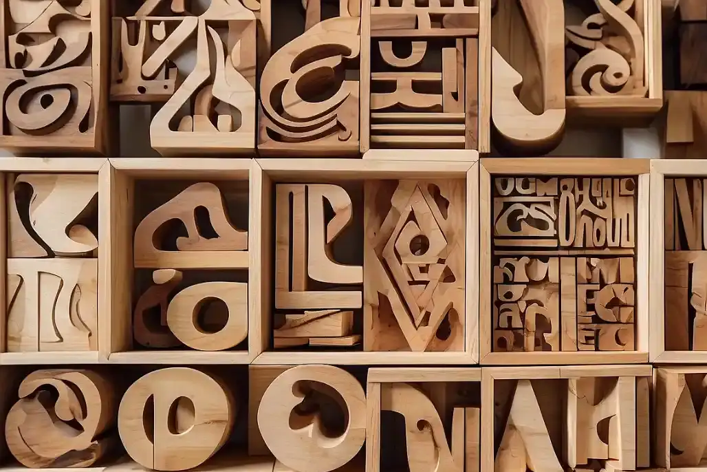 04 Jan 24
Classifying Typefaces
Typography is a crucial element of design, playing a significant role in how we perceive and interact with visual content. Understanding the various classifications… 14 Dec 23
FOCUS
Lorem ipsum dolor sit amet, consectetur adipiscing elit, sed do eiusmod tempor incididunt ut labore et dolore magna aliqua. Ut enim ad minim veniam,…